Our Brand
Logos
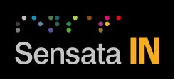
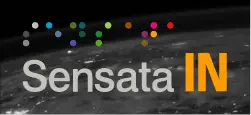
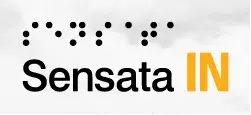
There is no INSIGHTS without Sensata, and our logo is constructed to reinforce this relationship.
Our Logo Makes INSIGHTS Iconic.
A brand is more than a logo, however, we’ve taken great pains to ensure that our logo makes the Sensata brand come through loud and clear.
![]()
![]()
![]()
![]()
![]()
Sub Brand Identity
Our shorthand identity system is easily recognized without overpowering the existing Sensata Technologies logo. It’s an ownable expression of “insights” that stands out in a sea of buzzwords and is easily applied to other business units. Like the periodic table, these two-letter tags help define the elemental pieces of Sensata Technologies’ corporate structure without being redundant, overplayed or trendy. And finally, IN captures our spirit of going all IN, being IN vehicles and tightly tied IN with our partners.
We are proud of our heritage.
We’ve taken great pains to ensure the Sensata brand comes through loud and clear. There is no INSIGHTS without Sensata and our logo is constructed to reinforce this relationship.
-
Lockup Construction
Remaining true to our roots, our logo is based on the proportions of a single dot from the Sensata Graphic Element. The IN is set in Univers LT Std Bold Condensed in our new INSIGHTS Orange.


-
Clear Space
Our logo must be easily seen and recognized. Don’t crowd it with other images or type. The minimum clear space should always be x on all sides of the signature.


-
Minimum Size
To ensure clarity and legibility, we have established a minimum reproduction size. The logo may be scaled up as large as you wish, but it should not be smaller than the recommended minimum size shown here.


-
Maximum Proportion/Minimum Distance
Take special care that the descriptor does not overpower or be seen as part of the logo. We recommend that INSIGHTS never be taller than .75% of the height of the lowercase “n” in Sensata and that it never be placed closer than the minimum distance of one “IN” from the logo.


-
Special Application
The INSIGHTS descriptor can be rotated 90º for long, horizontal layouts, such as a circular trade show sign or banner. We recommend that it align to the height of the logo and be placed no closer than the minimum distance of one “IN” from the logo.


Reinforcing who we are
As we build awareness and promote the adoption of our identity system, a descriptor should always be visible with our logo to reinforce our name.
INSIGHTS should always follow the logo and never proceed it. This descriptor should always appear in all capital letters and either to the right of or beneath the logo.
Conspicuously Visible
It is important that the descriptor be conspicuously visible with our logo to reinforce the connection. Do not place the descriptor so far away that the logo and descriptor cannot be seen at the same time.
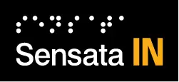
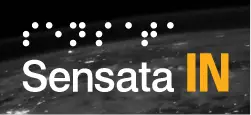
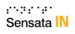
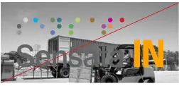
IN Treatment
There may be instances where space doesn’t allow for the standard Sensata INSIGHTS logo to be featured. In this instance, you can use this abbreviated “IN” treatment. Examples include usage within browser tabs, social media posts, video conferencing backgrounds, etc. Only use when space is limited.
- This treatment is not intended to be a standalone logo or a direct replacement for the Sensata INSIGHTS logo. Therefore, “Sensata INSIGHTS” needs to be included in text and easily visible when this treatment is used.
- Render this treatment in 85% dark gray when using it as a watermark.
Being Bold Starts With Optimum Contrast.
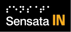
Our products stand out in a crowded market and our brand should stand out as well. We use two grays from the Sensata brand palette to increase contrast of the Sensata wordmark for dark and light backgrounds.
Light Logo
- For use on dark backgrounds, the Sensata wordmark is set in Light Gray.

Dark Logo
- For use on light backgrounds, the Sensata wordmark is set in Dark Gray.

Special Applications
- 2-Color Light
- 2-Color Dark

- Reverse
- Black
Horizontal Logo Applications
Use the same color variations and follow the same guidelines for these horizontal logo treatments as previously outlined for the stacked logos.
Light Logo
- For use on dark backgrounds, the Sensata wordmark is set in Light Gray.

Dark Logo
- For use on light backgrounds, the Sensata wordmark is set in Dark Gray.

Special Applications
- 2-Color Light
- 2-Color Dark
- Reverse
- Black
Authorized Reseller
To indicate authorized reseller status, make sure the Sensata INSIGHTS logo is featured prominently, then insert the words “Authorized Reseller” beneath it in gray italics with initial caps. Much like the standard Sensata INSIGHTS logo, you can choose different variations, including light, dark and special applications.
Light Logo
- For use on dark backgrounds, the Sensata wordmark is set in Light Gray.


Dark Logo
- For use on light backgrounds, the Sensata wordmark is set in Dark Gray.

Special Applications
- 2-Color Light


- 2-Color Dark

- Reverse


- Black

There may be times when the Sensata INSIGHTS logo should not be used, whether due to size limitations or the inability to have a secondary descriptor. In these circumstances we recommend using the text version.
-
Text Version
In exceptional circumstances, it may not always be possible to use the logo due to certain size limitations. In such cases, remember that legibility is your top priority. The text version of our name in Neue Haas Grotesk Bold is acceptable in these situations.

-
Product Badging or Packaging
Another option for a color application in text, Sensata should be either light gray or dark gray and INSIGHTS should be INSIGHTS orange.

-
Endorsements
When locking up with a partner logo, we recommend using the text version with this endorsing statement: Empowered By. Consistent wording, spacing and placement is how we will gain market recognition.


Logos — Acceptable Use
The Sensata INSIGHTS logo should always appear clear and legible. By following a few general guidelines, we can ensure that the signature always appears in the best light.
Dark Logo
- White background
- Light photographic background
Light Logo
- White background
- Dark photographic background
2-Color Light Logo
- Black background
- Dark photographic background
2-Color Dark Logo
- White background
- Light photographic background
Black Logo
- White background
- Light photographic background
Reverse Logo
- Black background
- Dark photographic background
Logos — Unacceptable Use
The strength of the Sensata INSIGHTS brand depends on you. Take care to ensure correct and consistent logo use in every application. Changing or redrawing the signature in any way weakens the power of the image and what it represents.
Do not change spacing
Do not change the font
Do not recolor the logo
Do not resize elements
Do not apply a gradient
Do not rotate
Do not change proportions
Do not use IN with corporate logo
Do not use light logo on light background
Do not use dark logo on dark background
Do not place over busy backgrounds
Do not put a box around the logo