Our Brand
Visual Identity
A consistent visual approach is essential to building and maintaining the Sensata INSIGHTS brand.
Speaking Volumes Through Visual Identity.
Our communications and our brand should be recognizable without even having to read a word.
Primary Color Palette
Our brand identity is built to make a disruptive splash in the telematics space. We use black and white in sharp contrast with INSIGHTS Orange, which was uniquely crafted for this business unit. Additional colors from the Sensata palette are used to add depth and visual interest.
-
Black
#000000
R:0 G:0 B:0
C:0 M:0 Y:0 K:100
PMS Black C
-
INSIGHTS Orange
#fbad18
R:251 G:173 B:24
C:0 M:36 Y:100 K:0
PMS 137 C
-
Light Gray
#c4c5c5
R:196 G:197 B:197
C:11 M:8 Y:9 K:14
PMS Cool Gray 3 C
-
Dark Gray
#5e646b
R:94 G:100 B:107
C:33 M:23 Y:18 K:55
PMS Cool Gray 10 C
-
Blue Violet
#5b6fb5
R:91 G:111 B:181
C:71 M:58 Y:0 K:0
PMS 7456 C

Secondary Color Palette
Additional colors from the Sensata Technologies corporate palette can be used to designate aspects of the business, such as product categories.
-
Red
#de2535
R:222 G:37 B:53
C:0 M:97 Y:82 K:7
PMS 1795 C
-
Light Brown
#9d6210
R:157 G:98 B:16
C:2 M:48 Y:97 K:41
PMS 146 C
-
Violet
#9c497c
R:156 G:73 B:124
C:29 M:79 Y:13 K:18
PMS 682 C
-
Blue-Green
#007882
R:0 G:120 B:130
C:94 M:9 Y:33 K:33
PMS 7474 C
-
Medium Green
#6bae3c
R:107 G:174 B:60
C:58 M:0 Y:100 K:11
PMS 369 C
-
Magenta
#ec008c
R:236 G:0 B:140
C:0 M:100 Y:0 K:0
PMS Process Magenta C
-
Medium Gray
#939798
R:147 G:151 B:152
C:22 M:15 Y:16 K:31
PMS Cool Gray 7 C
-
Brown
#8a742f
R:138 G:116 B:47
C:18 M:29 Y:83 K:41
PMS 4495 C
-
Teal
#006e5d
R:0 G:110 B:93
C:87 M:11 Y:58 K:40
PMS 568 C
-
Green
#00a34c
R:0 G:163 B:76
C:92 M:0 Y:100 K:4
PMS 355 C
-
Light Green
#a1ce60
R:161 G:206 B:96
C:36 M:0 Y:76 K:0
PMS 367 C
-
Medium Blue
#598cb8
R:89 G:140 B:184
C:65 M:33 Y:8 K:5
PMS 7454 C
-
Light Blue
#00aeef
R:0 G:174 B:239
C:100 M:0 Y:0 K:0
PMS Process Cyan C
-
Olive
#668140
R:102 G:129 B:64
C:46 M:12 Y:81 K:36
PMS 575 C

Graphic Elements
Data Convergence Gradient
Our Data Convergence Gradient, leading with INSIGHTS Orange and drawing from the Sensata corporate palette, represents the collection and flow of data as it is aggregated, analyzed and turned into insights.
The Data Convergence Gradient should always follow this order: INSIGHTS Orange, Red and Violet. The gradient should always start in the top left corner and expand to the bottom right corner. The gradient should always show the full spectrum.

Typography
Actively. Boldly.
Intelligently.
Our typography is the written expression of our brand voice and personality. We use scale and weight to make a point and draw the reader in.
Headline and Subhead Font
We stay close to our roots using a Swiss style font revived for digital. Neue Haas Grotesk Display is confident, bold and dependable — just like us.
https://www.myfonts.com/collections/neue-haas-grotesk-font-linotype
https://fonts.adobe.com/fonts/neue-haas-grotesk
Text Font
Roboto is our body copy font. This is a universal font that is easy to read and easier to access.
We make data make sense.
Neue Haas Grotesk Display Bold
Our full-stack portfolio is extensive and flexible.
Neue Haas Grotesk Display Light
Sensata INSIGHTS offers onboard vehicle integration and cloud APIs, giving you the ability to have a single view, drawing meaningful insights, from disparate data sources. We can customize your solution based on your individual business needs and goals.
Roboto Regular
Photography
Natural light. Authentic. Clear focus.
There are four types of photography that we use depending on the story we are telling, however, each of these approaches always use the consistent elements of natural light, clear focus and authentic presentation.
-
Product
Tight shots that make our products the hero.
-
People
Shots of people in work environments interacting with or benefiting from our products.

-
Place
Wide shots of workplaces where our products are relevant.
-
Epic
Extreme aerial or ground shots from unique perspectives that demonstrate the impact of our products.


Illustration
Iconography
Icons should communicate concepts simply, at a high level, and be repeatable when possible to support understanding and not overcomplicate.
- Uniform stroke
- Can be colored
- Do not fill in background

Product Illustration
Technical illustrations can be employed to show detail and highlight specifications.
- Minimal stroke variation
- These types of illustrations should maintain consistent angles and have minimal variation in stroke weight.

Differentiation Icons
These icons symbolize the three key factors that make Sensata INSIGHTS unique. Each icon is paired with specific copy that provides context behind its meaning.
Ecosystems
Ecosystem illustrations represent key industries and environments that utilize solutions from Sensata INSIGHTS. Each of these illustrations has been designed to stand alone or connect with other ecosystem illustrations when spotlighting multiple industries.
Although the images are primarily grayscale in nature, specific areas are rendered in yellow to highlight where key Sensata INSIGHTS solutions can be utilized.
Use these illustrations to highlight specific scenarios and demonstrate how our solutions are used in real-world applications.

Connect the Dots
Our Connect the Dots Graphic symbolizes the organization of data and is used as an overlay. Its scale is meant to accent imagery. The intent is not to convey an overwhelming amount of data.
- Adjust scale so as not to compete with other elements (image detail, text, iconography)
Dot Pattern
In addition to the Connect the Dots graphic, this dot pattern can be used as a graphic overlay to add visual interest and texture to imagery.

Connect the Dots graphic – with this technique, a darkening layer may be applied over the base image so the dot graphic doesn’t blend into the background.

Representing a data grid comprised of several white dots at 20% opacity, this pattern includes select dots in full color for added visual interest. Colors are at 100%.
Circle
Use this circular graphic treatment to zero in on an industry, highlight a service or call attention to a specific task.
Ensure that the image within the circle is black and white, and that the outline around the circle appears in INSIGHTS orange.
Data Point Dot
An INSIGHTS Orange dot can be used to highlight points of data collected. This can be a single dot or series of dots.
- Adjust scale for interest and legibility

Circle graphic

Data point dots
Product Branding
-
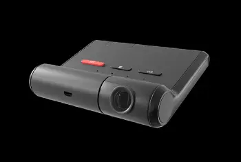
Logo Badging on Product
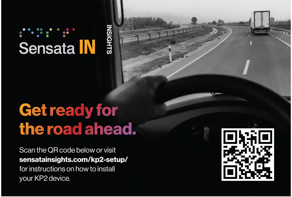
For product badging on devices in view, always use the full-color horizontal Sensata IN logo. For devices normally not in view of the end user, an all-white (on black) or all-black (on white) logo badge can be used.
-
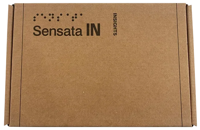
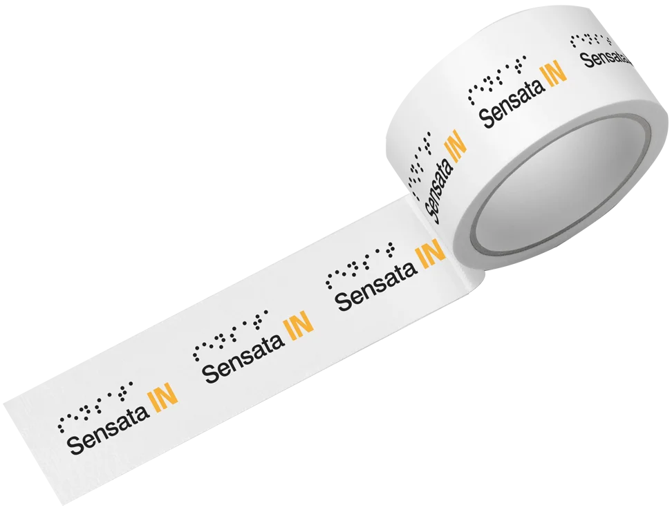
Logo Printed on Product Boxes and Packing Tape
For all product boxes, use the horizontal 100% black logo that includes “INSIGHTS.” Seal shipping boxes with Sensata IN logo packing tape.
-
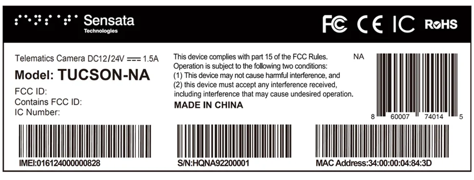
Logo Use on Product and/or Box Labels
For labels with “official” info such as model and/or serial numbers, use the horizontal Sensata Technologies logo. If there isn’t enough space, use the vertically stacked Sensata Technologies logo instead. For labels without official information, use the Sensata INSIGHTS logo.
-
Logo Use on Product Promotional Labels
Always use the Sensata INSIGHTS logo on promotional product packaging labels, and ensure it conforms to the brand guidelines.

Highlight Photo Treatment
Our highlight photo treatment employs our Data Convergence Gradient and dot pattern graphic over epic photography to make an indelible statement.
When selecting photography, images with large areas of midtones work best. To avoid the gradient from appearing too bright, it may be necessary to feather or mask portions of the photo.
- White page
- Photo at roughly 65% opacity
- Gradient with blend mode set to color
- Graphic set to 20% opacity

Connect the Dots Treatment
Use this graphic treatment to visually communicate how Sensata INSIGHTS connects the dots between multiple IoT data sources and delivers meaningful insights from those intersections.
Create a rich effect by positioning a black overlay over a black and white photo. Use the random pattern color overlay for the dots visual. Be sure to connect a minimum of 2 dots (or several to show multiple connections), but do not connect them all.
- White page
- Photo at roughly 100% opacity
- Black overlay 35%-65% opacity
- Connect the Dots 100% full color
Insightful
Photography is primarily displayed in black and white. Within each black and white image is an element that appears in color.
This element represents something that is insightful (based on the topic), and can be a person, vehicle, Sensata INSIGHTS solution, etc.
Color is used to draw the eye to it immediately and help it stand out. The rest of the image should remain in black and white and serve as a visual “canvas” to bring emphasis to the full-color elements.
Abstract Data
Photography and illustration can be used to conceptually communicate abstract data. Imagery should reinforce the collection, organization, analysis or prioritization of data.
To ensure the integrity of the brand, take care to choose imagery that is unique and original —avoiding clichéd and over-used metaphors.